|
My first programming of the museum felt inefficient, and cluttered. The space felt layered, but unorganized. I reprogrammed the flow plan of the space to emphasize compression and expansion qualities of air waves (executed by ceiling heights) as well as focused on creating a more indoor/outdoor space where visitors could be educated about sustainable living and coalescing their lives with nature. How do I go about creating an indoor/outdoor space that supports education and communication? Using the case studies from Morocco, India and Africa I wanted to stick with the idea of the central courtyard, ensuring that any additional levels could easily view down into it. I also wanted to feature a screen to block the sun on the West side of the building to shade the building from direct sun exposure. Below is the new plan view of the retail space showing how the second and third floors will be stacked and their site lines into the central courtyard. 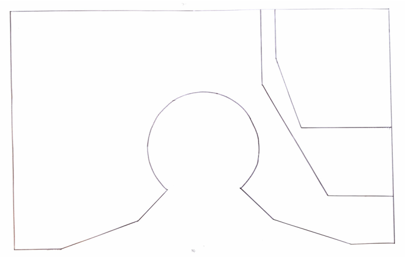 I also wanted to deemphasize the retail portion of the store, and decided that the ideas of compression would allow people to feel cozy and comfortable, but to eventually be drawn into the courtyard. Also, I wanted to give dominance to the learning aspect of the building. I fulfilled this function by dedicating one side of the space to retail and then stacking the learning levels on top of each other to give more weight and gravity to the learning portion. 
Due to this change in programming I rendered some new schematize designs which explored the scale and relationships of the project. Below is an orthographic rendering of the new space showing the North, West and East elevations. Also, in this new plan, I wanted to mingle visitors as much with nature as possible and as such the roof is retractable and can fold under the third level. Also the windows are on tracks and are able to open, teaching people that living with and in nature is possible. 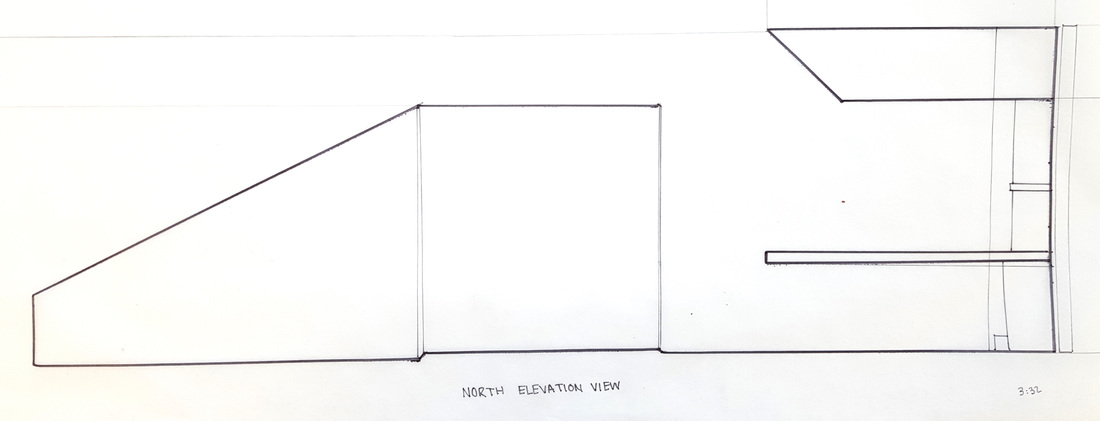 North is the front view of the building.  The East elevation shows how the third level sits on top of the building as an extra entity. It also shows the angle of the window which will direct the viewer's eyes to focus down into the courtyard.  The West elevation shows the glass wall which- in reality- will be covered with the Moroccan screen, but was omitted to show how the ramps will be stacked. In this rendering the American Disability regulations were followed. My next step was to develop the design into greater detail and give a more complete thought example of what the building and space was going to look like. Below is a rendering of the North side of the building without furniture. 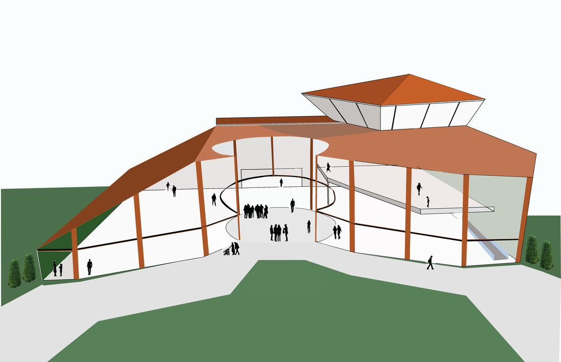 I feel satisfied with my progress and my redesign. The client does not care how long a design took, only what it finishes as. I feel confident in my final rendition of this retail space.
*** I have done more research on the act of programming which can be found in my 'Research' tab.
0 Comments
Leave a Reply. |
AuthorAs a student at Cornish College of the Arts in Seattle WA I entertain a variety of factors while designing space. Archives
May 2016
Categories
All
|


 RSS Feed
